The Grail Tastings
Visual Identity Rebrand
The Grail are a whisky and spirits tasting business located in Callander Drinks Company, a popular tourist stop to and from the Highlands. The name is inspired by the comedy film 'Monty Python and the Holy Grail' as filming took place in nearby Doune Castle, in the village of Doune, where The Grail were formerly based.
The faces of the brand are Jen Laird and Rachel Grant who proudly confess to being 'two whisky geeks on the quest for the holy grail of drams', They host public, private and virtual events and discuss all things spirits related including reviews, distillery visits and insights on their YouTube channel.
The Grail got in touch as they were looking to refresh their visual identity. They felt that what they had was dated and lacked the flexibility needed to push the brand physically and digitally. It was important to maintain an element of recognisability as they'd built a reputation and loyal following with the previous identity.
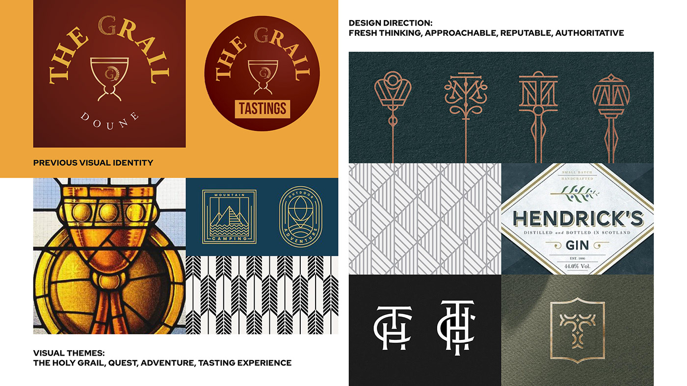
Visual Identity
The lockup follows a similar layout to the previous identity, with stylistic changes and adjustments to the hierarchy.
The grail cup is now the central focus while the logotype and text elements have been modernised and strengthened. An additional 'TG' monogram replaces the previous 'G' and a geometric pattern is included in a band around the cup, which signifies 'the quest' with onward movement. The new design maintains a similar colour palette, brightening the red and gold, adding a vibrant secondary red and featuring more white.
This new suite of logos that includes a lockup, two logotypes and a monogram provides more flexibility, allowing the brand to use their identity across multiple formats.


The Tasting Experience


Digital Assets

© Gavin Reid Design 2022


